Fortunately this is something that you can generate with just a few steps. Once the graph has been created you will have a number of different options for customizing the way your data is displayed. So continue below to find out how to make a graph in Google Sheets.
How to Make a Graph in Google Sheets
Our article continues below with additional information on creating a graph in Google Sheets, including pictures of these steps.
Tools You Will Need
Computer with Internet connectionModern Web browser like Chrome, Firefox, or EdgeGoogle AccountGoogle Sheets file with data for graph
How to Create a Graph in Google Sheets (Guide with Pictures)
The steps in this article were performed in the desktop version of Google Chrome, but will also work in other modern Web browsers like Firefox and Microsoft Edge. This guide will assume that you already have a spreadsheet containing data that you want to put into a graph, but you can also create a new spreadsheet and add the data for the graph as well.
Step 1: Go to your Google Drive at https://drive.google.com. If you aren’t already signed into your Google Account you will be prompted to do so.
Step 2: Open the Google Sheets file containing the data you want to graph, or create a new spreadsheet file.
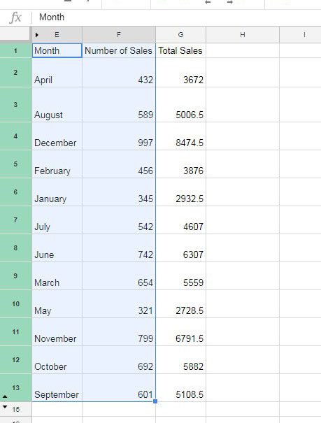
Step 3: Select the cells containing the data that you want to put on the graph.
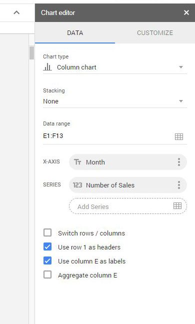
Note that you will want to have a header row in row 1 that contains the names that you want to use for the x and y axis of the graph. In the image below that would be “Month” and “Number of Sales.”
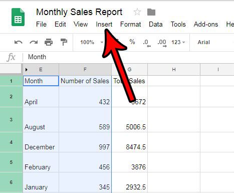
Step 4: Click the Insert tab at the top of the window.
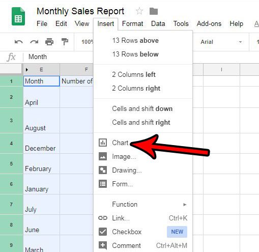
Step 5: Choose the Chart option.
Step 6: Find the Chart editor column at the right side of the window, where you will see a number of different options for customizing the appearance and layout of your graph.
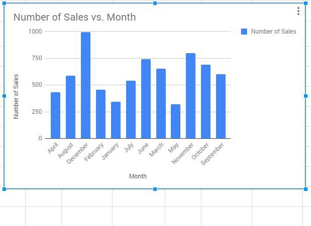
There should also be a graph on the spreadsheet displaying your graphed data using the current settings in the Chart editor column.
Step 7: Adjust the settings in the Chart editor to get the graph appearance that you need for your work.
Google Sheets Chart Editor Options
The options in the Chart editor on the Data tab are:
Chart type – Select the type of graph for your data. There are a ton of options on this menu, so you can experiment with them until you find the one that works best for you.Stacking – This option will let you display “stacked” data in your graph, but requires multiple columns and a specific format. You can read this article on Google’s support site for additional information on stacked charts.Data range – This setting defines the range of cells in your spreadsheet that are comprising the data display for the graph. You can change this if you want to use a different range of cells.X-axis – You can modify this to change the data that is being used to determine the x axis of the graph.Series – You can modify this to change the data that is being used for the y axis of the graph.Switch rows/columns – Turn your rows into columns and vice versa for the graph layout, which will affect the way that the graph data is displayed. This can be useful if you want to switch the x axis and y axis in Google Sheets.Use row x as headers – Select this if your data contains headers that you want to use to label the axes of your graph.Use column x as labels – Select this to use the data in the specified column as labels for your data.Aggregate column x – This lets you aggregate the data in the specifiedcolumn. Note that this may not change anything depending on the type of data in that column.
There are additional options available if you click the Customize tab in the Chart Editor. These options include:
Chart styleChart & axis titlesSeriesLegendHorizontal axisVertical axisGridlines
Additional Notes
If you update the data in the cells that are populating the graph, then the graph will update automatically.While Google Sheets will save itself automatically when you make changes, this doesn’t happen if you lose your Internet connection. So make sure that you see a “Saved” note at the top of the page if you have done a lot of work that you don’t want to risk losing because you don’t have an Internet connection.If you click back into the spreadsheet, the Chart editor column will disappear. You can reopen the Chart editor by clicking the three dots at the top-right of the graph, then choosing the Edit data option.
Would you rather work on your spreadsheet in Excel than Google Sheets? Find out how to export a Google Sheets file for Microsoft Excel by downloading a copy of the file in the .xlsx file format.
Additional Sources
After receiving his Bachelor’s and Master’s degrees in Computer Science he spent several years working in IT management for small businesses. However, he now works full time writing content online and creating websites. His main writing topics include iPhones, Microsoft Office, Google Apps, Android, and Photoshop, but he has also written about many other tech topics as well. Read his full bio here.
